Friday, 21 May 2010

Ideas for 3D functional item


1.12.15
1.12.14
1.12.13
1.12.12
I tried a different coiled shape , this reminded me of an image of coiled neurons from my sketchbook. This would not make a container but could be used to store items say in small pockets along the lines of a jewellery roll. The vertical sections would fit well with the repeating design patterne I created in chapter 11.
1.12.11
1.12.10
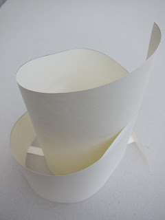
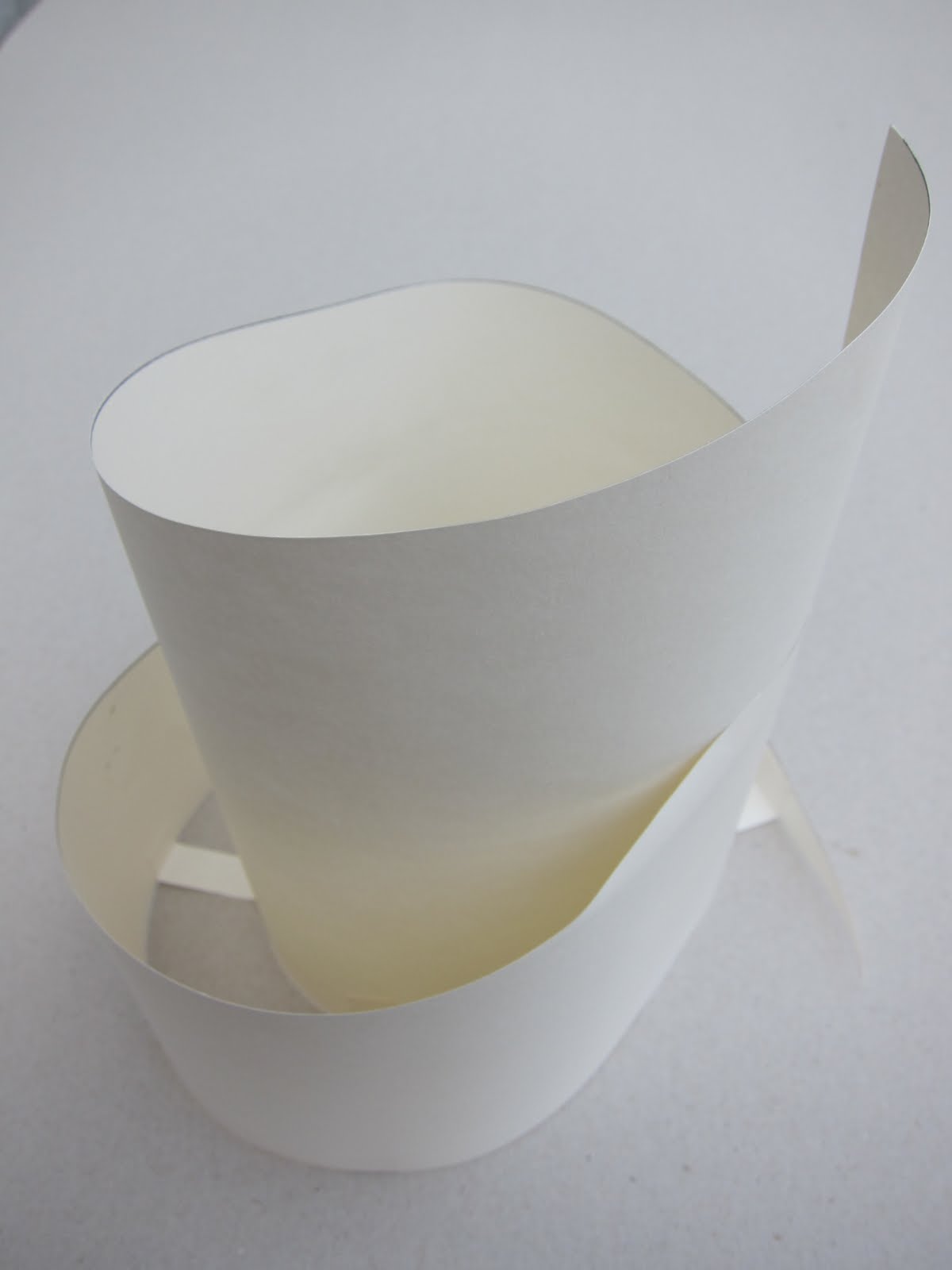
I also wondered about a coiling shape but without a lid so I tried this shape. Not so sure this goes with my theme but the fabric I could make for this could carry the hollow tear drop shape in the design.
1.12.9
1.12.8
1.12.7
At the prompting of Maggie I tried the tear drop as a vertical container that looks like a peeled banana when open! This was quite tricky to make out of paper but would be fine in fabric.
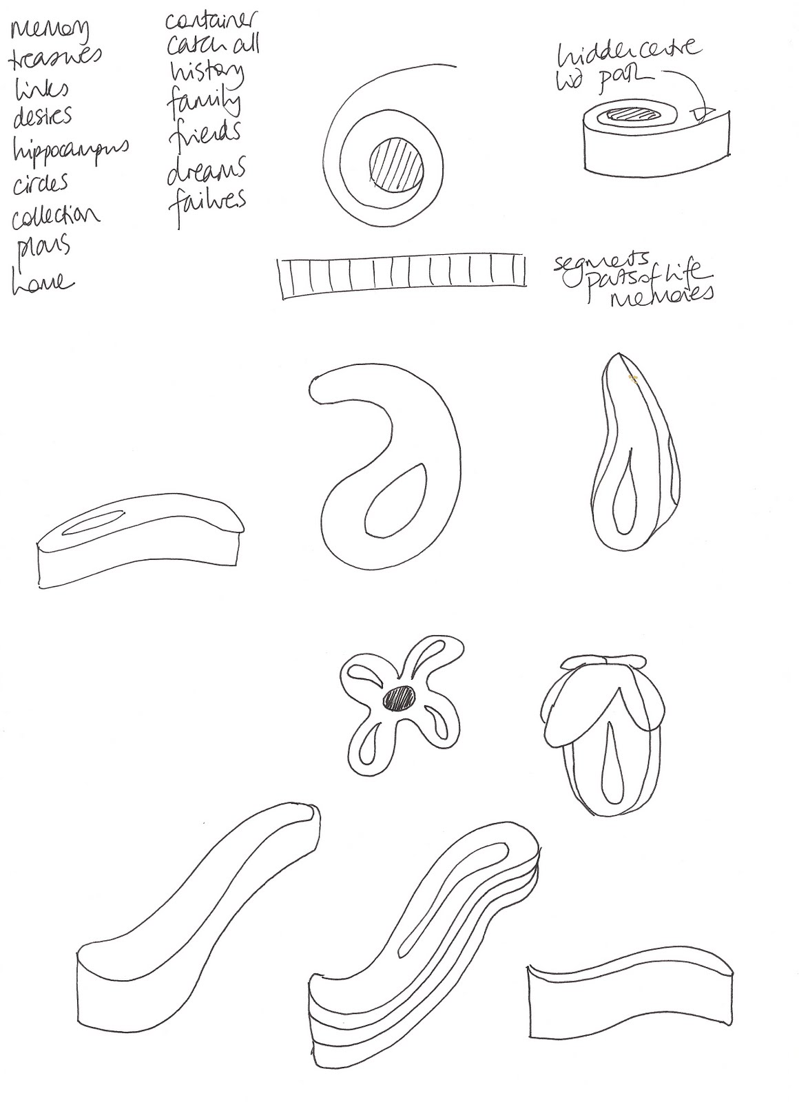
I made another sheet of ideas. 1.12.6
1.12.5
This is a practical shape and sturdy enough to use as a container. However it doesn't show the original shape properly as it is not a solid tear drop shape. I have tried cutting out the central section to reproduce the shape more accurately. As this would take away from the box idea I have tried filling the space with a layer of translucent tissue paper.


1.12.4
1.12.3
1.12.2
I tried one of the ideas in paper, firstly a tear drop shape. 
1.12.1
I have been looking at possible ideas using the theme of memory. I would like to make a container in which to keep special items. I have used the shape based on the hippocampus which is the area of the brain involved in the making of our memories. This is essentially a teardrop shape.

Saturday, 8 May 2010

Chapter 11 continued

1.11.16 I like this one and I prefer the colours. The original design source is more closely linked to the idea of memory so I feel more comfortable with that. I may use this design.1.11.15 I like this but not sure whether to take it further. The dark grey is actually an indigo.1.11.14
I have chosen 3 designs and added some extra lines using Markel sticks. The first was originally my favourite but not now I have added to it as it looks very disjointed.

Monday, 3 May 2010

Chapter 11 Bold design

My next task is to choose one, as I am thinking I will convert one into a fabric from which to make a 3D container. My blogger has been really difficult to use this time so I can't see the wood for the trees. So I will make some samples, to see how viable a couple of designs are to reproduce, once my brain clears!
1.11.13 This is my favourite of this batch as I like the way the dark blue line takes your eye through the design.
1.11.12 This is the first of the ideas using a distorted fragment . I made a number but have only shown a couple in each case.
1.11.11 Lastly I had a go with pieces of a blue design.
1.11.10 I like this one because I would enjoy reproducing it as an embroidery.

1.11.9 Again I took a fragment and rearranged it into a pattern. Then I repeated this with another fragment.

1.11.8 This is the next design I looked at.
1.11.7 I think I like this best of this design.
1.11.6 Next I tried distorting the fragment then repeating to make a pattern.
1.11.5
1.11.4 I tried making multiple repeats but thought these looked like busy wallpaper!
1.11.3 Next I played with these in word in order to make new patterns.
1.11.2 I cut this into random fragments on the computer eg as above.
1.11.1
First I looked at a drawing from an earlier chapter because I liked the colours and the shapes which were linked to the idea of memory in brain anatomy. I have wondered about going down that road as the theme for the final 3D piece. Sian suggests a number of ways of creating bold marks to echo previous designs including using previous work. I wanted to try developing three of my drawings/designs to see what would happen when I looked at fragments of the bigger marks.

Wednesday, 28 April 2010

Chapter 10 Design exploration with image copies - Option C

1.10.12 This is a close up of the result. I like the clarity of the design and the little pools of intense colour.
1.10.11 I used hand dyed linen as a background and attached the 2 pieces of decorated paper with 505 then small stitches. Then I hand embroidered the piece to echo the paper design.
1.10.10 I photo copied it and then drew into the design using coloured pencils.

1.10.9 I like the simplicity here and the mottled background of the reverse of the paper. I decide to use this design to take forward.
 1.10.8 Too busy again and I couldn't work into it easily. I couldn't use bleach on this as the colouring is done with markel sticks and oil pastels. I do like the soft colours and edges though so I may draw on these papers in the future!
1.10.7 shows 2 designs woven into each other. I thought it would be difficult to work into this as I needed more background and I didn't like the contrast of plain paper. I do like the reverse side here as rusty patches have occurred despite using a green wash. The front side is too much like a child's drawing as I used crayons.
 1.10.6 shows the original orange washed copy as the background to the coloured reverse side. The orange is too strong despite being a dilute wash and drowns the coloured side. Also the design is too busy.
1.10.5 shows another variation. I like these blue designs as they are simple and lend themselves to working into them. However I don't want to use blue so I tried with the orange and green designs. 

1.10.4 shows a blue washed copy as a background to the reverse side coloured.
I cut these into sections as in 1.10.2 and rearranged them, sometimes combining more than one.

 1.10.3 markel sticks and watercolour pencils washes with water. I like the colours here.
 1.10.2 cut into sections. This is the front of an orange wash of the bone corpuscles.
1.10.1
I made black and white photocopies of a few of my collected images and then washed them with diluted ink in my colour scheme. I coloured these in on the front or the back using a mixture of crayons, pastels, markel sticks and water-soluble pencils. These are 3 examples of these. The first is coloured on the back of a blue wash.

Thursday, 15 April 2010

Stitched samples


The sixth is my favourite as I like the colours and enjoyed the embroidery. It is based on the cut ends of the neurons on which I based the colour study. I machine embroidered the green circles and filled them with tiny spots of colour using satin stitch.

The fifth shows bone corpuscles using four layers of dyed fabrics, embroidered then variously cut back using reverse applique techniques. I tried to use the sewing machine but the sandwich was too thick. Some of the fabrics were very densely woven cottons so were very difficult and painful to hand embroider! With different fabrics I would have done more embroidery using toning colours.

The fourth image shows two representations of myelin around nerves in cross-section. The upper shows shadow work herringbone stitch on a single layer of silk chiffon. The lower shows trapunto quilting using coloured synthetic fibres from Oliver Twists on a double layer of chiffon..

The third shows a tangle of neurons in the brain using machined cords couched on to the backing fabric and whipped back stitch lines..

The second shows bundles of neurons as seen on an electron micrograph. I made hand wrapped cords for the bundle and torn chiffon for the backing layer.

In more detail the first shows variably padded silk embroidered with clusters of french knots depicting the holes in the brain caused by amphetamine usage.
Here are the stitched samples based on my designs. I have used a variety of hand-dyed fabrics in my colour scheme (Procion dyes on natural fabrics).

Sunday, 4 April 2010

Colour study


These are the patterned papers I made with reference to the hollow tubes in the photo.

Of these on the backgrounds of different colours my favourite are those on the darker tones, see the picture above.

These are my colour experiments on paper, different groupings and different backgrounds. 
I have taken my inspiration from this scanning electron microscope photo of bundled neurons as I love the colours, especially the insides of all the little tubes.

Friday, 2 April 2010

Shape study

As I have done this before I made a number of samples which I liked without following the chapter that closely. These were the more successful. The only disappointment really is that on the blog the yellow and green papers which have gold or bronze oil pastel or treasure wax on them appear rather mustard coloured and dull. The highlighting sheen is lost but never mind!